Building components for an open-source, Korean-first design system
Visit Dale UI ↗1 of 2 designers
DaleStudy
Ongoing
published on npm
v1.0.0
Design systems
Design-dev handoff
Documentation
As a designer, I built new components from start to finish, including the API, dev handoff, and QA. I also led the system's documentation and its v2 roadmap.
Predictable, composable component APIs, a Figma kit mapped 1:1 to code, and a prioritized v2 roadmap.
View UI Kit ↗Why another design system?
Dale Study's community services looked inconsistent. And most open-source systems are built English-first.
The Korean-first foundation (type tokens, accessible color, test infrastructure) was a team effort. My work was the layer on top: the components and how they're used.
Adding components
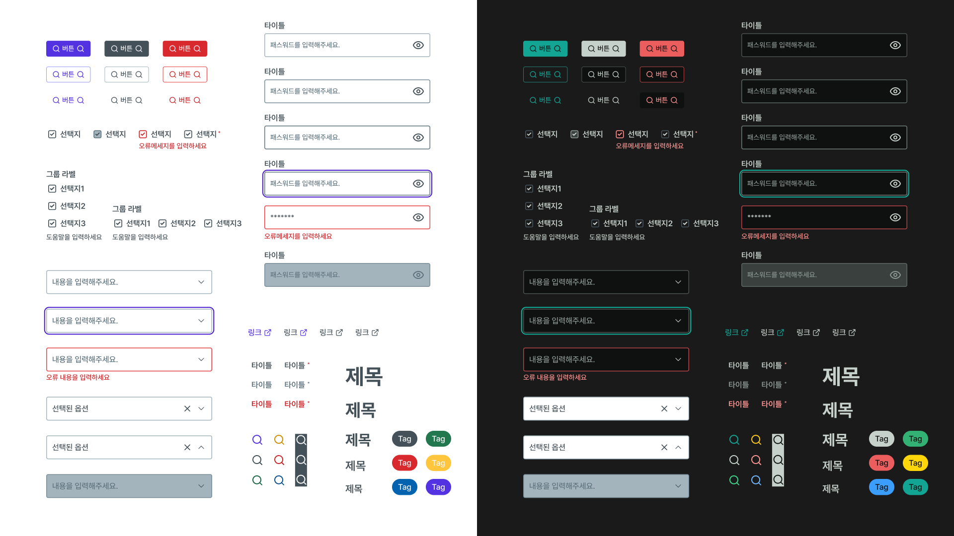
I built new components from start to finish. I designed their props and API, agreed the shape with dev, and scoped each one so Figma and code shipped together.
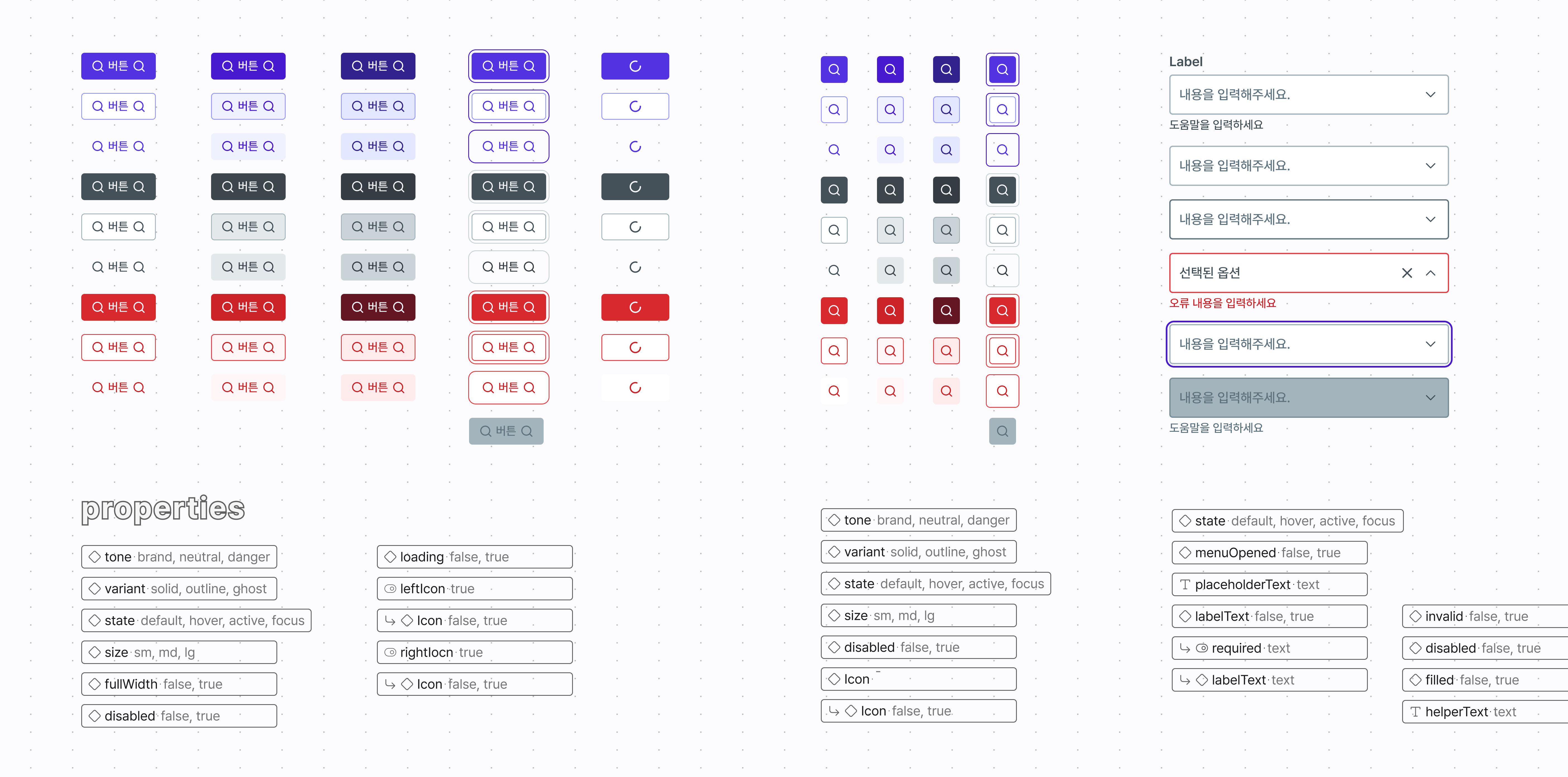
Two calls I made along the way that shaped how the components are built.
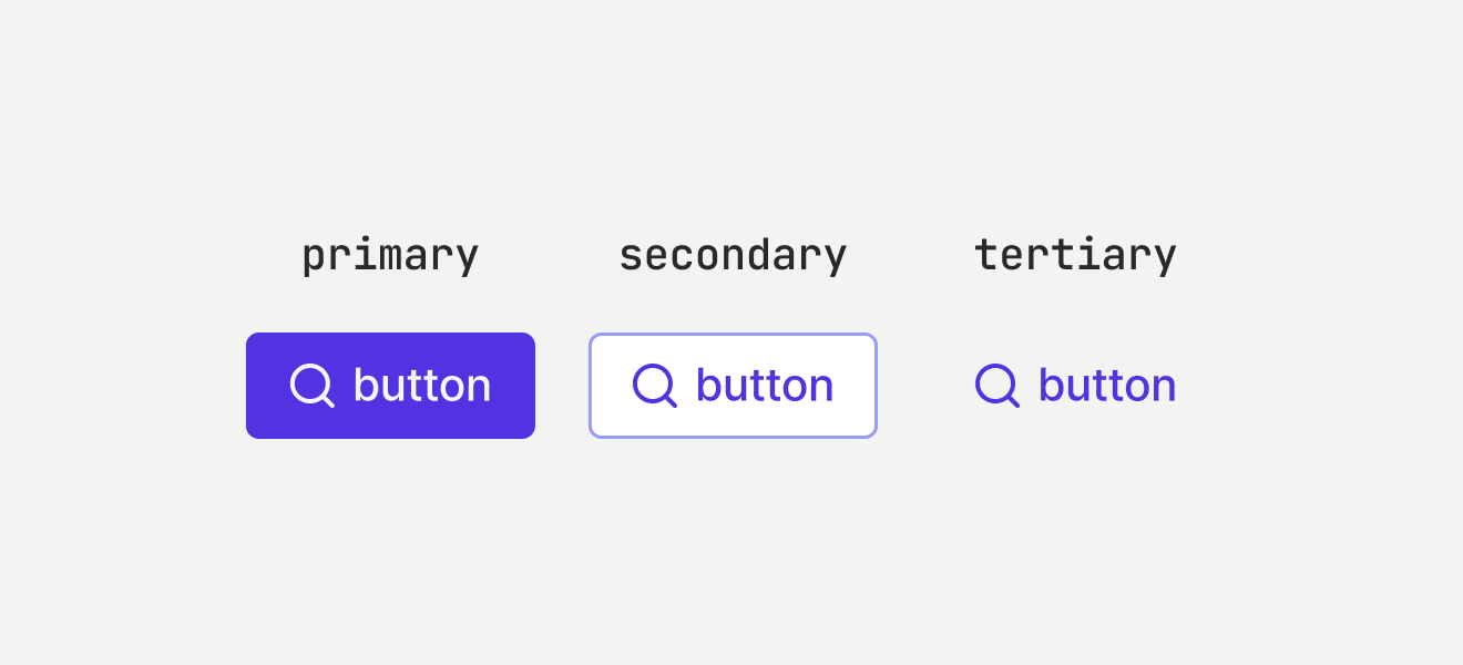
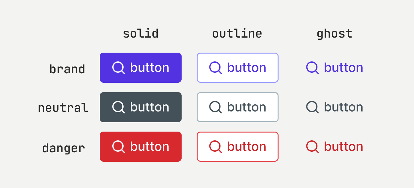
Option A would've been simpler, but as an open-source system others build on, I chose independent tone × variant axes, scalable yet trimmed to only the variants and axes that earn their place.
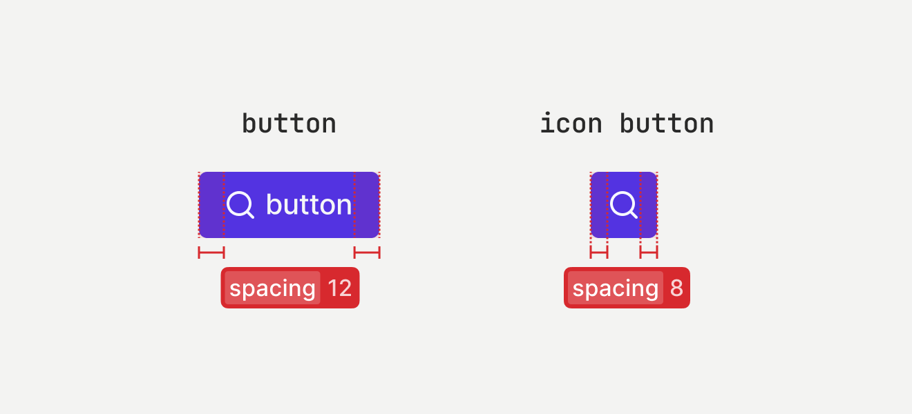
Icon Button didn't exist yet. Dev pushed back: just detect a single icon and shrink padding evenly. But that wasn't buildable in Figma, and it broke our rule of keeping design and code APIs aligned. So it shipped as its own component.
Documentation that scales
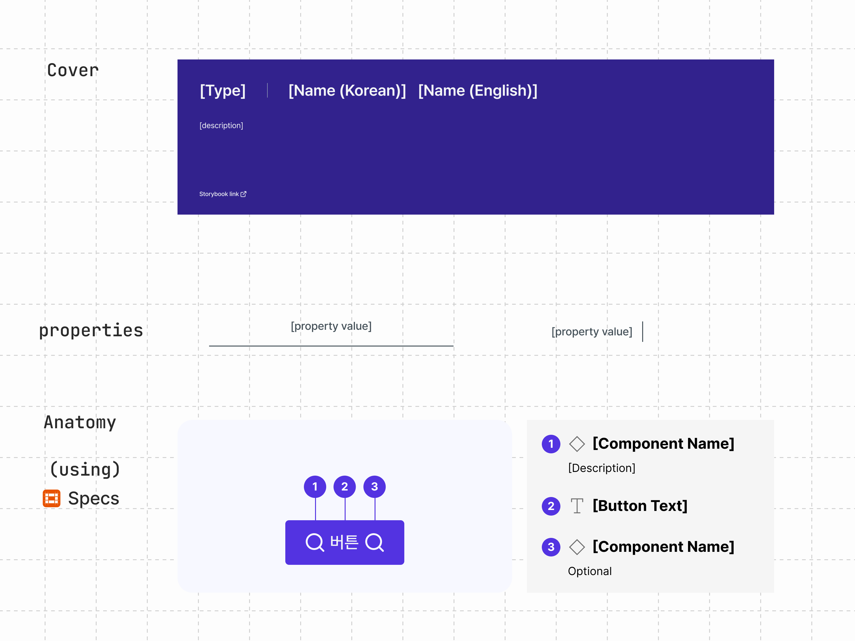
To keep contributions consistent as the team grows, I built reusable doc templates. Each one sets a single structure for anatomy, props, usage, and accessibility, so every component is documented the same way.
Setting the v2 roadmap
We had limited capacity and too many components to build. I drove the prioritization. Claude helped with research and the grunt work, but the framework and the calls were mine.