Making 6-way pricing easy to choose
Redesigning a product detail page to stop drop-off and make a 6-option pricing system scannable. For a legal e-book subscription service, on desktop.
1 of 3 designers
1 month · Shipped
Biblioteca Hamangiu
Information architecture
Interaction & visual design
As the product designer, I turned a hidden 6-way pricing system into one scannable CTA, cutting the path to purchase in half.
4 → 2
was 4
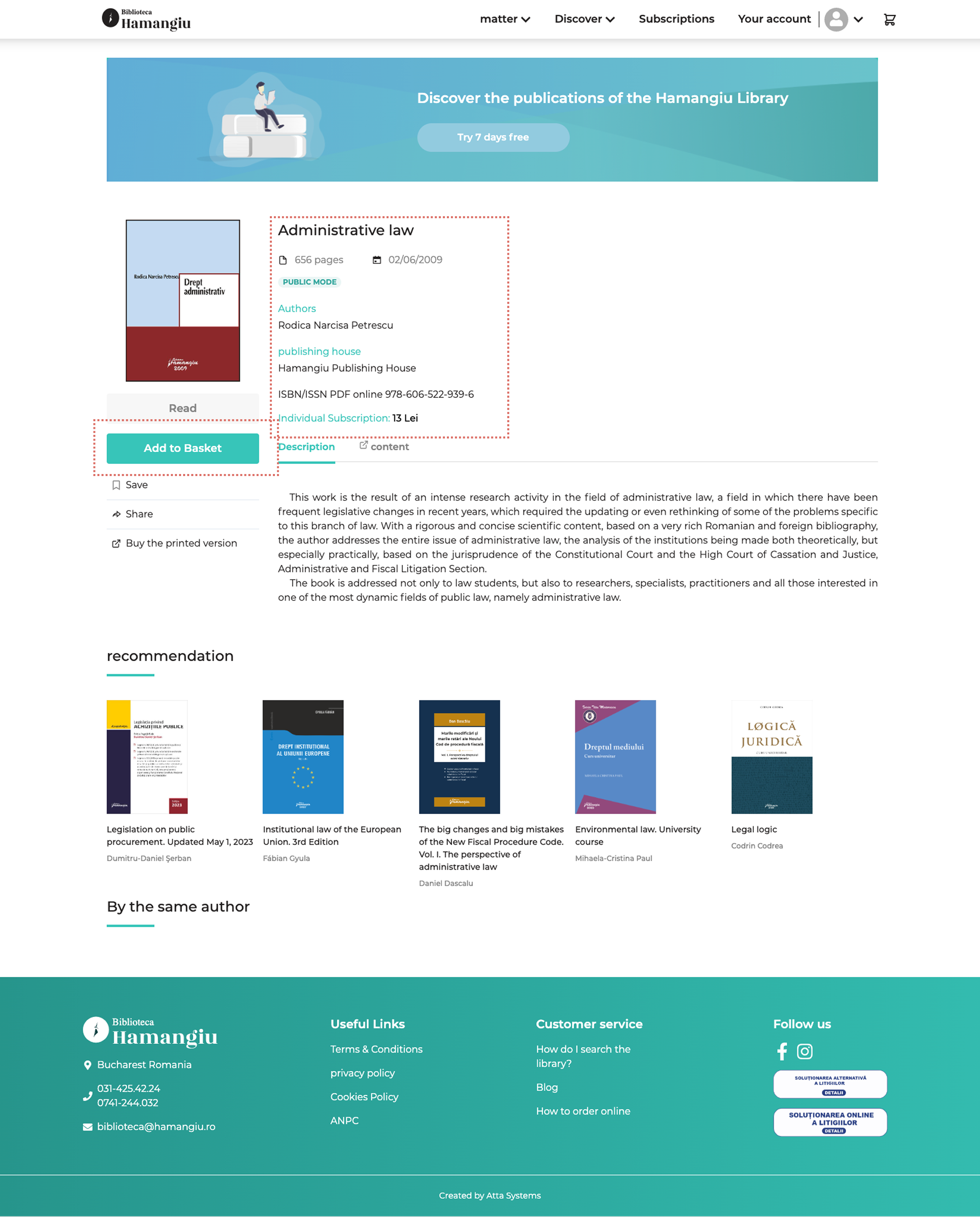
Users left the detail page without buying
One flat “Add to Basket” hid a 6-way pricing system. It sat behind too many clicks and too little info to decide with.
How might we let users decide whether to subscribe at a glance, right on the detail page?
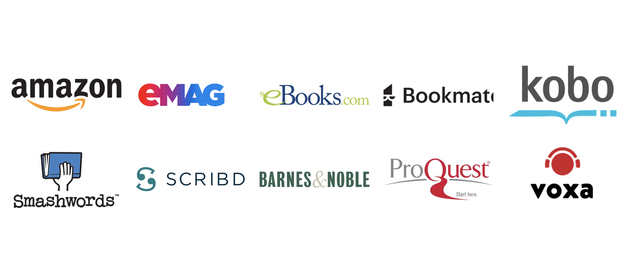
Competitive research
With no users to interview, I looked at how others solve this. I compared layout and CTA structure across 10+ e-book services to find the patterns buyers expect, and where our page fell short.
Comparing page layouts, then CTA structures
The research narrowed it to two questions: how to structure the page, and what shape the CTA takes. I worked them in that order.
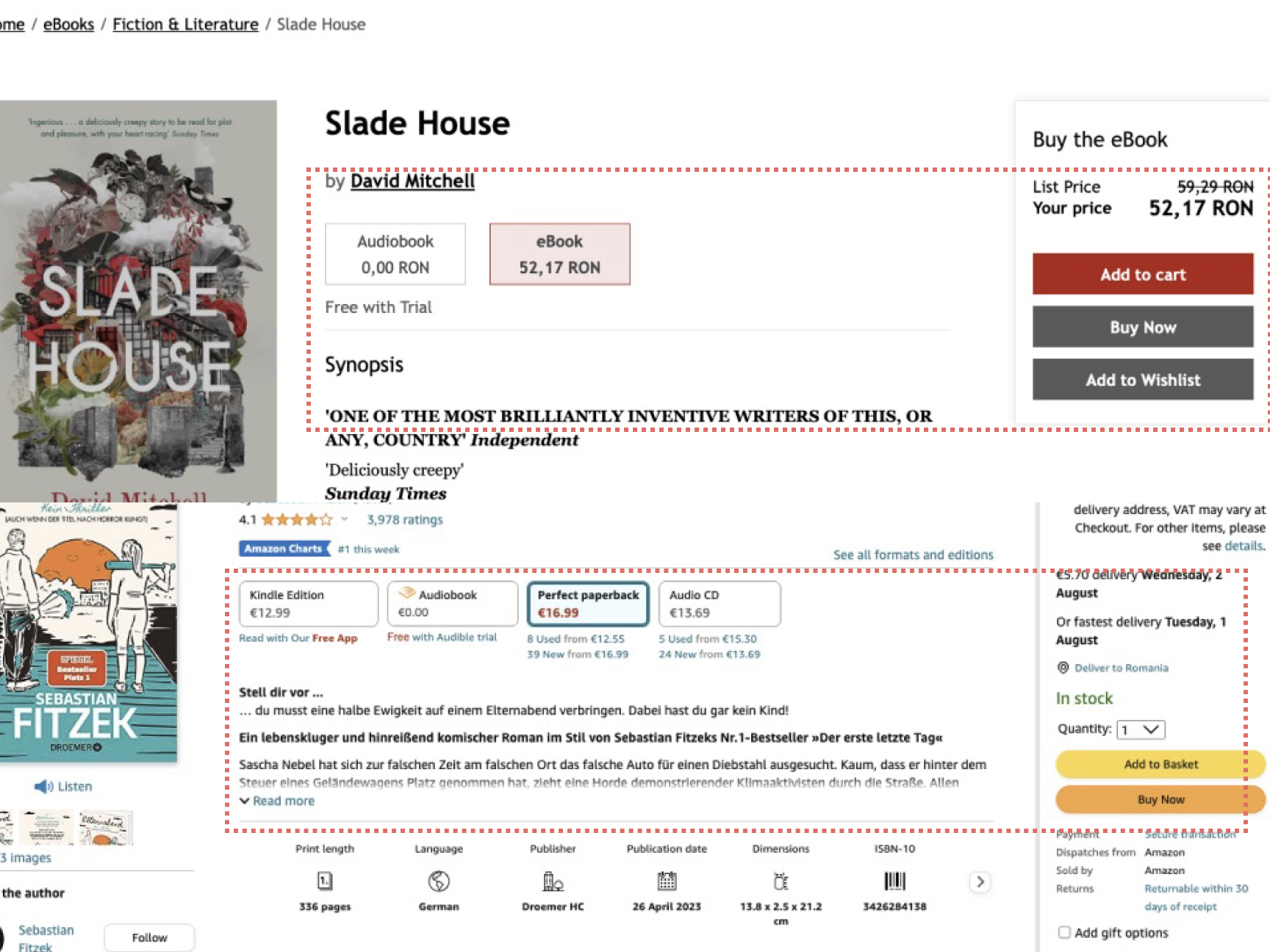
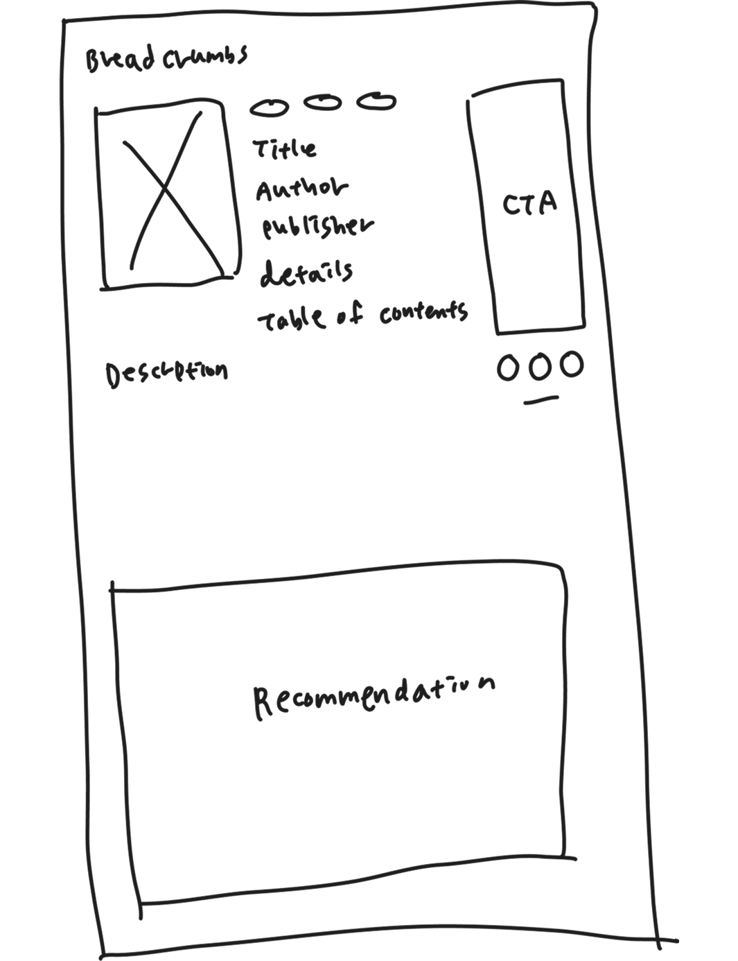
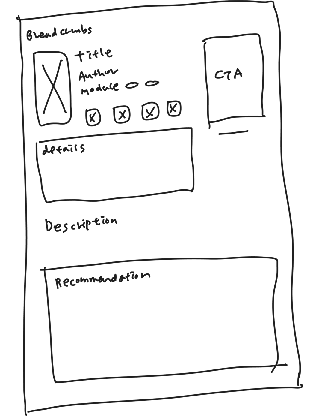
01Page structure
I chose Option C: the least dense layout, with cleaner detail and CTA areas, accepting scattered buttons I'd consolidate next. A and B both crowded the CTA and details.
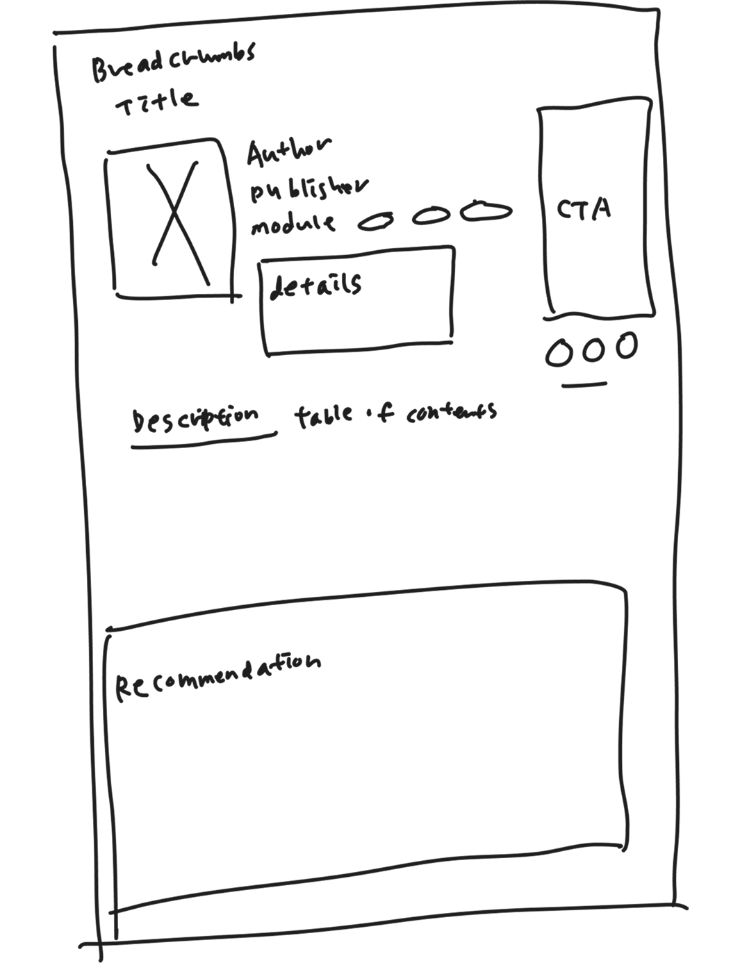
02CTA shape
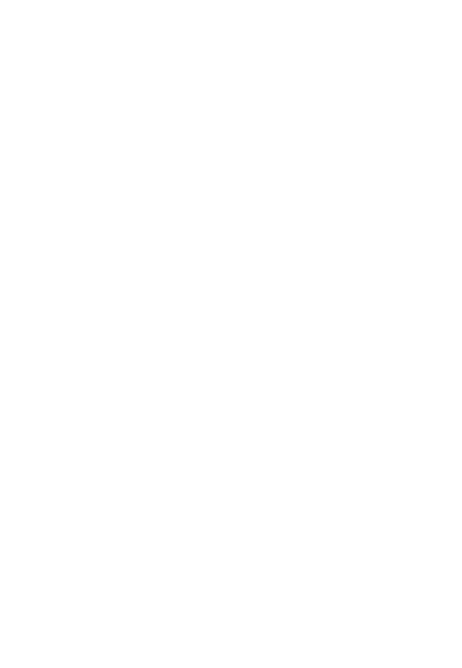
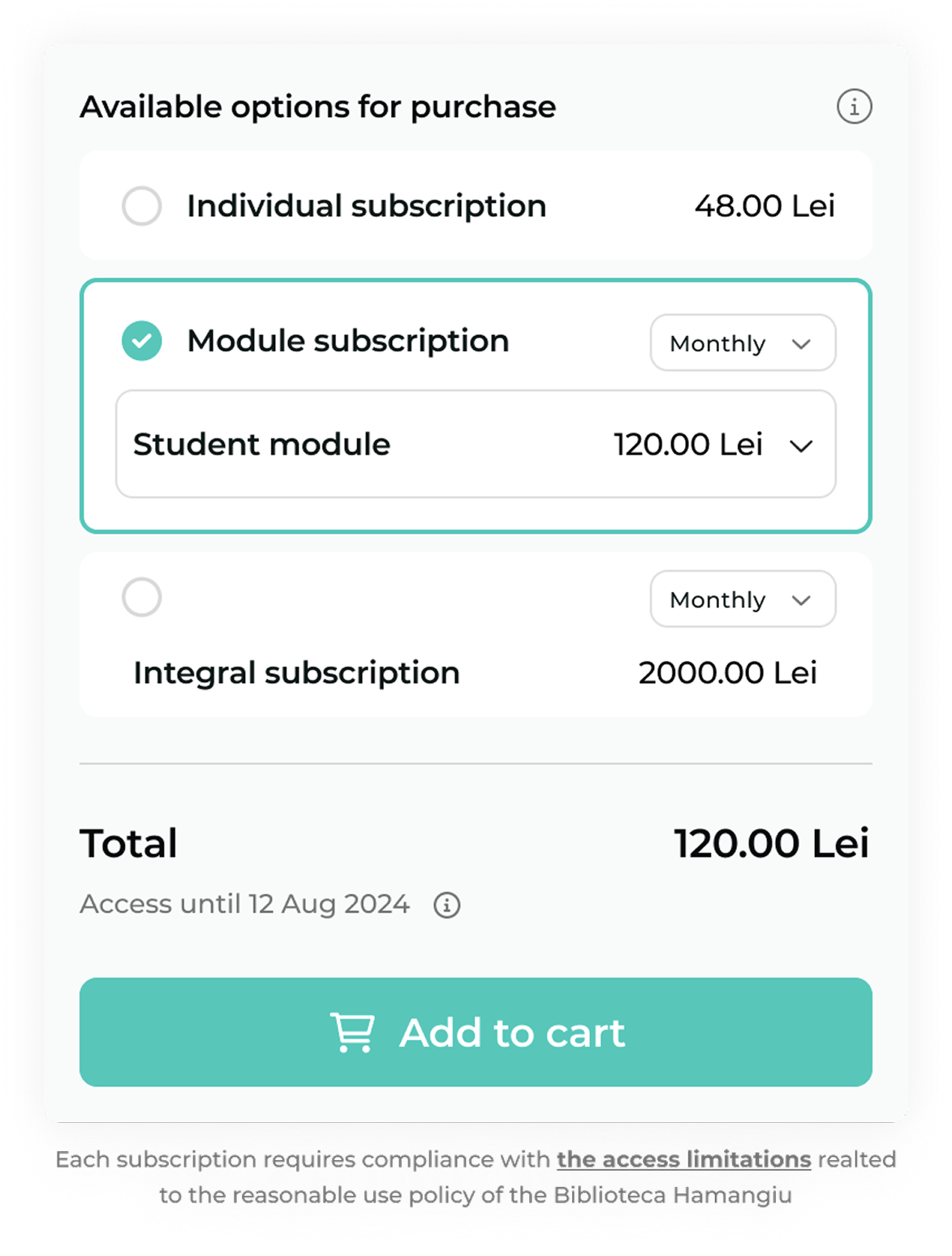
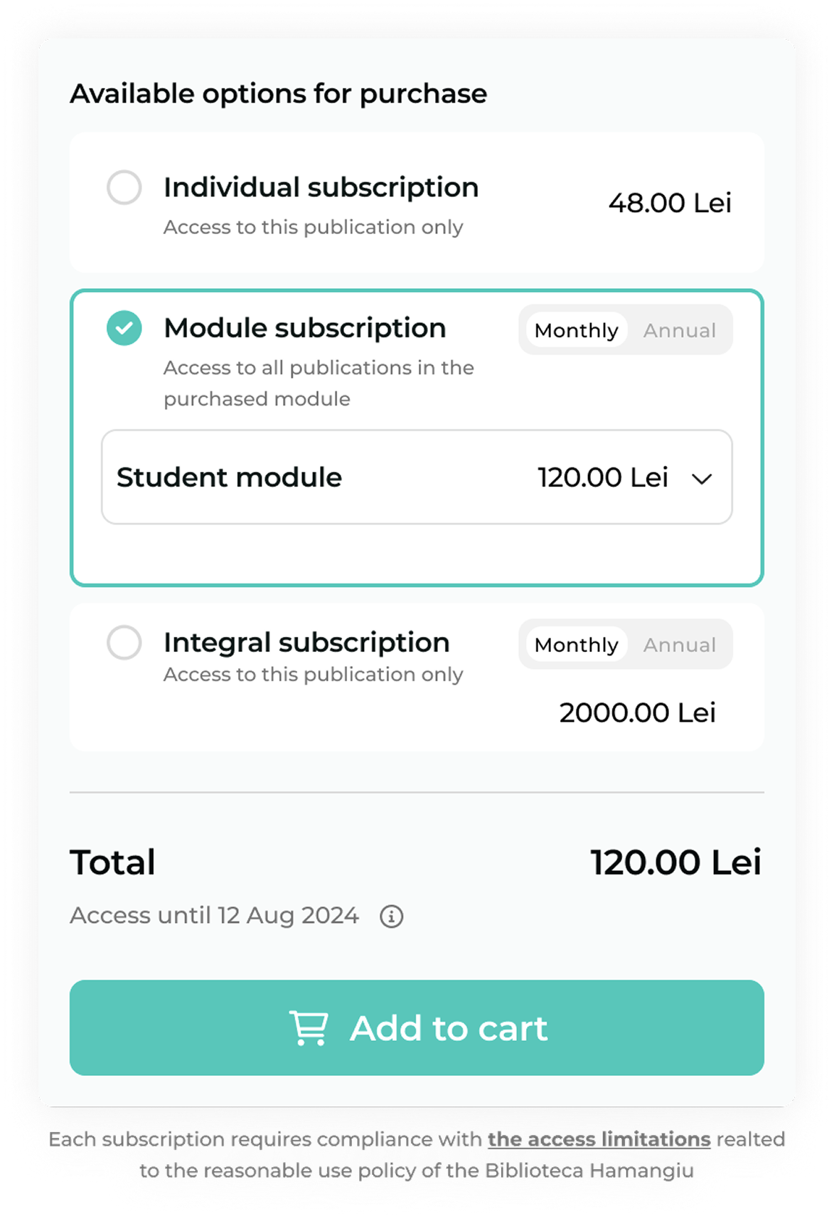
For holding all 6 plans I compared three structures: a dropdown, tabs, and stacked blocks. Dropdown and tabs both hid options again, so stacked blocks won: everything stays visible and comparable. I developed its details in the solution.
Making complex pricing scannable
Three moves made the 6-way matrix readable top to bottom:
- Blocksseparate each purchase option.
- Toggleputs monthly and annual on equal footing.
- Contraston title and price guides the eye.
Half the clicks, options no longer hidden
The redesign shipped to desktop, cutting purchase from 4 clicks to 2 and surfacing pricing that used to be buried.
What I'd measure now it's live
The problem was drop-off, so that's the first number I'd watch.